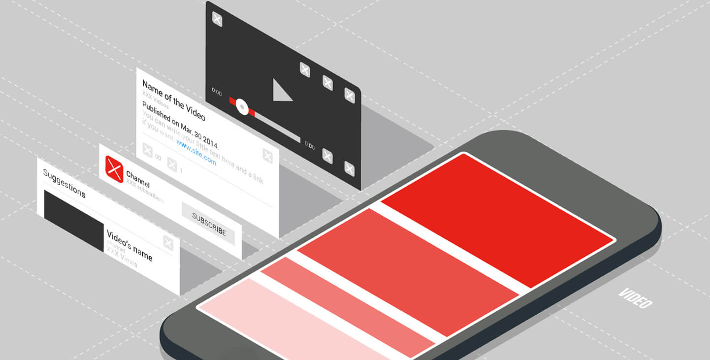
The sole purpose of the Google Material Design was to build a consistent visual language for all of their products. It further creates a consistent Google Look that their users can become accustomed to while navigating between Google products.
Do you think you need to implement Material Design in your Mobile Application Development?
Of course, implementing material design can help you save lots of time required to develop a visual language. Apart from this, it helps to understand common design pitfalls.
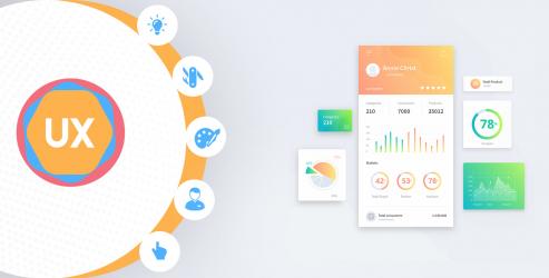
Do you what makes an app different from the others available at Play store? Well, the biggest difference between a good app and a bad app depends on the quality of its user experience.
Usually, a good UX can only distinguish your app from the rest in piles. Today, as the mobile phone is getting smarter, the Mobile users expect a lot from an app. This means users are looks for complete marvel user experience including fast loading time, ease of use and smoothness while interactions.
No doubt, Mobile phones are more than a mandate, According to some survey, the average US spends 5 hours per day on mobile. The vast majority of that time is spent in apps and on the website.
While implementing Material Design, make sure it is justified or necessary for Android app development. In general, it relays on the client?s demand or for what's the purpose of the app. The Material Design proposed for Android application should be intriguing enough to intensify the user's reach and download - with the unique look and feel and quick animations along with conventional effects.
Must Read: Why Hire Dedicated Virtual Android App Developer For Enterprise?
Well, there are many things that need to be considered, when it comes to mobile app design.
Let's focuses on some of the most crucial aspects to look upon;
Think Wisely:
To design imaginative design and visual effects, it's necessary to implement the Material design for the android app development irrespective of screen sizes. determining the exact app purpose will further reduce development time and efforts. For this, you can hire an expert UI designer.
A-List Concept:
Get started with your concept by blending the design element. The user-facing page is the reflection of enterprise and allows quick reach and increase in brand value.
Right selection for Color Palette and Typography:
The built-in systems widgets offer the unique style of display. It allows the developer to execute easier and quick transformation in the color palette. Further, the bunch of default animations for touch feedback and other activity style transitions are also available.
It offer a unique experience to the users and for this, it is highly recommended to choose a creative color palette and typography that perfectly matches brand requirement. Make the choice that is eye-captivating rather pinching eyes. .
Actual User-Friendly Mobile App:
For Android Material App Design, designers must focus on Material Design concepts and guidelines, as many time they forget to notice usability suggestions. It really important to understand user expression to create a visual impression in the Mobile app design.
Material Design conforms to Layered Structure - here each layer is specified with a unique shadow or color effect. Vector icons are developed with different screen size compatibility, thus, it automatically gets resized without modifying the appearance. And this also makes APK size for compacts.
Cognize Material Design Norms:
It is recommended to go through the Material Design for the Android Application Development. For this, users have access to numerous seminars, webinars, tutorials, and educative websites. These available resources helps UI and UX designers, to understand the model and ideal requirement before execution.
Examine Feedback:
Feedback is the best way that helps to Improve your design. Feedback of users and client provide an insight on perspective usability, choices, and disparities. Their penetration and unmatched pre-assumed functionality are meaningful for additional updates and corrections.
Google in Material Design concept adds perk where action design uses motion and then transform to design leaving an intense impact on the user's perception.
Earlier animations and effects like real objects lacked standard form, but with Material Design fix speed duration can be managed to make impressions that are user-friendly and faster, with predefined models.
Minimal Functioning:
A simple design is what that attracts the users, at first sight, keeping the user at ease with the product. Hence, the method of minimal functioning supports issues related to a cluttered UI. Consequently, it is advised to keep the content and interface elements to the minimum.
Use Familiar Screens:
Familiar screens are those screens that users go through very often in different apps. For instance; The screens like ?Gettings started,? ?What?s new? and ?Search results? holds a de facto standards for mobile apps.
Therefore, no additional explanation is further required as users are already familiar with them. This allows users to practice prior experience to interact with the app, without the new learning curve.
Conclusion:
Being a top Mobile app development company - At Root Info Solutions, we adopt the latest development tools and technology. We understand the need for Material Design, one of the main element for the Android Platform to achieve both UI and UX at the same time.
The perfect combination of beauty along with the functionality, is what every makes a great design. This is exactly what you should try to focus when building an app. It?s tough to build perfect app right on the first attempt, but not impossible.
We help our clients continually in every evolving project, and depending upon the user feedback, endeavours to improve the experience.


